Saturday, February 27, 2010

Week 6 - Georeferencing Rasters


This map was yet another eye opener for me. As each week passes, more capabilities of GIS are revealed, and I simply amazed. Georeferencing allows the images and data to match.

For the first image, uwf_n, a first order polynomial transformation was used. The RMS error for this image was 0. The second image, uwf_s1, had a RMS error of 10.753 and used a second order polynomial.

Sunday, February 21, 2010

Week 5 - Hardee County

This map shows the invasive plants and wetlands of Hardee County, FL. The data was collected from the Florida Geographic Data Library and the Land Boundary Information Systems websites. I am beginner to GIS and I wondered where all the data comes from...this project helped me understand this. It is hard to believe that gathering data is excluded from GIS coursework. In the real world, this step is crucial.

As for the map... I do not know what happened with the scale bar but I just could not get numbers to correlate with the county map. Also, think the DRG Quad map is incorrect but I was unsure of what steps were needed to correct it. Collecting the data and was a little tricky at first but went smoothly once I figured it out. My goal was to get all the information on one map, which proved to be more work than If I had seperated the data into three maps. Overall, this project was a challenge, and aside from the forementioned issues above, I am okay with the final outcome.

Monday, February 8, 2010

Okay, so I figured out how to do the legend. Still need help on labeling.

Week 4


I had a lot of problems with this map. I wanted it to have a legend but I could only get it to work for one of the data frames at a time. So from there I tried to just label the selected features. For some reason it was not as easy as it seemed. I ended up exporting the selected data into a new layer and then turning off every field except the name and area.

Monday, February 1, 2010

Week 3

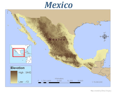
Map 3: This map was fairly easy to accomplish. I tried to figure out, to no avail, what units were being used for the elevation. I suppose I could have used another reference map but I really wanted to find out with the program. Is it feet or meters? I looked everywhere, except the right place... obviously.

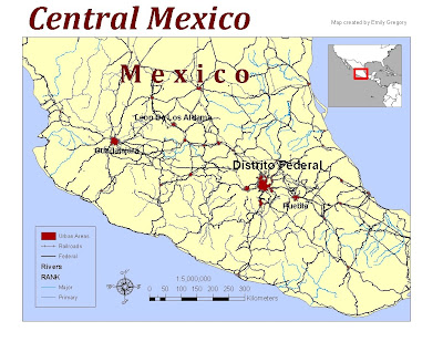
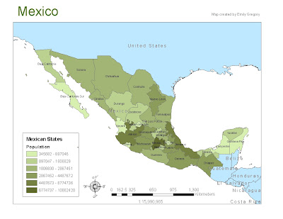
Map 2: Choosing the colors on this map drove me crazy. I suppose the conglomerate of information added to my frustration. It was difficult to make this map pleasing to the eye. I also had some trouble with the scale bar. I wanted to display 50 -100 then a progression by 100, no such luck. Map 1: I had to go back to the previous lesson in order to get the Population Data. I wasn't sure if it was the same due to the different labels.