
Saturday, July 24, 2010

Saturday, July 17, 2010
Week 9 - Homeland Security for Colorado

What a doozy!!! This lab could have gone much smoother if the data would have extracted properly. The files were extremely large and through trial and error I realized that once I was finished with a file, delete it. The raster file repaired easily butI could not figure out exactly how to set the scale to match the rest of the layers. I used NAD 83 UTM 13N and still would not work. I ended up with 6 layers. I was unable to locate the elevation files...and the structures layer was skipped. I am happy to report that the server did not freeze up once...very nice.
Wednesday, July 7, 2010


Tuesday, June 29, 2010

Tuesday, June 22, 2010


Tuesday, June 15, 2010


Sunday, June 13, 2010
Week 4 - Participation Activity
Geographic Information Systems (GIS) play a major role in disaster response. With any disaster, obtaining spatial information is a crucial element. The use of GIS can help with planning and recovery efforts. With regards to the Deepwater Oil gush in the Gulf of Mexico, GIS is a vital tool utilized by all entities involved with the clean up efforts. The maps produced through GIS provide useful information about wildlife and plant species, which in turn has guided desicions made by these entities. It has also illustrated the location of the oil as well as it's possible path.
Wednesday, June 9, 2010
Week 4 - Oil Gush
This week's focus was the Deepwater Horizon Oil gush in the Gulf of Mexico.
Part I: For part one, we were to delineate a fishing closure boundary within ArcGIS then import the shapefile in to Google Earth. There were a few projection issues along the way, but I must say, in the end I thought it was a very useful project.

 Part II Map 1: This map shows the booming operations, management authorities, and the socioeconomic areas for Okaloosa County.

Part I: For part one, we were to delineate a fishing closure boundary within ArcGIS then import the shapefile in to Google Earth. There were a few projection issues along the way, but I must say, in the end I thought it was a very useful project.

Part II Map 2: This map illustratees the environmentally sensitive areas and creatures of Okaloosa County. I am not too happy with how large the legend is vs the map but I felt that the data contained within was useful and chose to keep it in tact.
 Part II Map 1: This map shows the booming operations, management authorities, and the socioeconomic areas for Okaloosa County.
Tuesday, June 1, 2010
Week3 - Earthquakes
Deliverables 4 and 5: This map and table depict the infrastucture and health facility destrction by Hurrcane Katrina. Most steps were fairly simple. I just could not figure out how to properly label the streets. If I made one small change, the map would take several minutes to reload, even with all layers turned off.
 Deliverable 1: This map shows the land cover areas that were flooded by Hurricane Katrina in three coastal counties of Mississippi. I am still having issues with the Legend. I cannot get the headings right.

Deliverables 2 and 3: This map shows the flooded land areas from Hurrcane Katrina. The table shows the percentage of each area flooded.

Deliverable 1: This map shows the land cover areas that were flooded by Hurricane Katrina in three coastal counties of Mississippi. I am still having issues with the Legend. I cannot get the headings right.
Deliverables 2 and 3: This map shows the flooded land areas from Hurrcane Katrina. The table shows the percentage of each area flooded.

Monday, April 26, 2010
Final Project...
Here is the link to my Powerpoint Presentation...
http://students.uwf.edu/ecg13/BobwhiteProject.EG.ppt
Paper link...
http://students.uwf.edu/ecg13/FPS_EG.pdf
http://students.uwf.edu/ecg13/BobwhiteProject.EG.ppt
Paper link...
http://students.uwf.edu/ecg13/FPS_EG.pdf
Tuesday, March 30, 2010
Monday, March 22, 2010
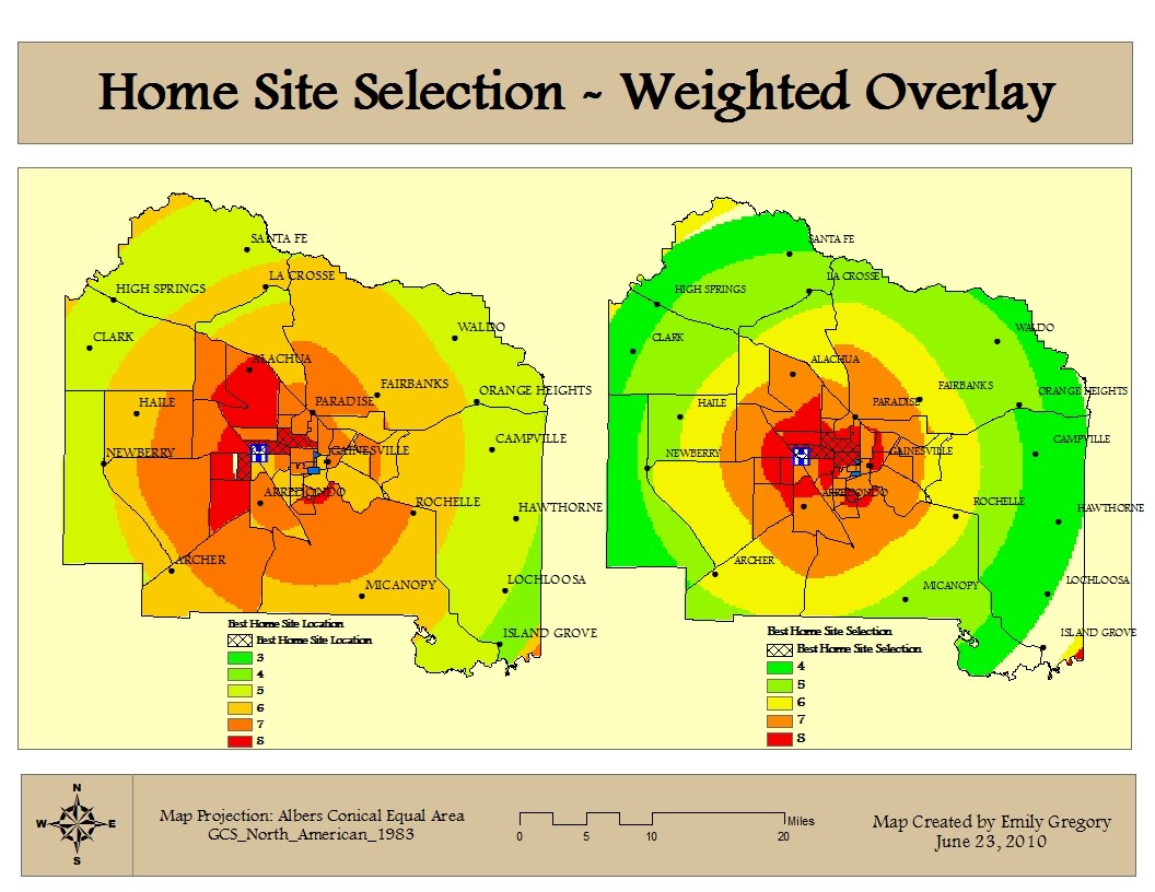
Week 8 - Vector Analysis

This week we learned how to buffer and overlay areas of a map. The project went smoothly until I tried to fine the area of the possible sites. I used a suggestion from the discussion board and came up with some numbers, I hope their right.
Question 1: For this step I used the intersecting overlay tool. I did not see a noticable change.
Question 2: I used the erasing overlay tool for this step because it was the most logical. The instructions asked to exclude one area from another which is exactly what this tool did.
Question 3: There were 79 features in this layer. The largest area was 7,765,034 sq. miles, and the smallest area was 748 sq. miles.
Tuesday, March 2, 2010
Week 7 - Data Editing
 This map should have been fairly easy, if only I would have taken my time in the beginning. After an hour or so from adding the athletic field shapefile and creating the new features, I realized it was a line feature instead of a polygon. Well, lesson learned. Other that that, it went okay.
Saturday, February 27, 2010
Week 6 - Georeferencing Rasters

This map was yet another eye opener for me. As each week passes, more capabilities of GIS are revealed, and I simply amazed. Georeferencing allows the images and data to match.
For the first image, uwf_n, a first order polynomial transformation was used. The RMS error for this image was 0. The second image, uwf_s1, had a RMS error of 10.753 and used a second order polynomial.
Sunday, February 21, 2010
Week 5 - Hardee County
 This map shows the invasive plants and wetlands of Hardee County, FL. The data was collected from the Florida Geographic Data Library and the Land Boundary Information Systems websites. I am beginner to GIS and I wondered where all the data comes from...this project helped me understand this. It is hard to believe that gathering data is excluded from GIS coursework. In the real world, this step is crucial.
 As for the map... I do not know what happened with the scale bar but I just could not get numbers to correlate with the county map. Also, think the DRG Quad map is incorrect but I was unsure of what steps were needed to correct it. Collecting the data and was a little tricky at first but went smoothly once I figured it out. My goal was to get all the information on one map, which proved to be more work than If I had seperated the data into three maps. Overall, this project was a challenge, and aside from the forementioned issues above, I am okay with the final outcome.
Monday, February 8, 2010

Week 4

I had a lot of problems with this map. I wanted it to have a legend but I could only get it to work for one of the data frames at a time. So from there I tried to just label the selected features. For some reason it was not as easy as it seemed. I ended up exporting the selected data into a new layer and then turning off every field except the name and area.
Monday, February 1, 2010
Week 3
 Map 3: This map was fairly easy to accomplish. I tried to figure out, to no avail, what units were being used for the elevation. I suppose I could have used another reference map but I really wanted to find out with the program. Is it feet or meters? I looked everywhere, except the right place... obviously.
  Map 2: Choosing the colors on this map drove me crazy. I suppose the conglomerate of information added to my frustration. It was difficult to make this map pleasing to the eye. I also had some trouble with the scale bar. I wanted to display 50 -100 then a progression by 100, no such luck.
 Map 1: I had to go back to the previous lesson in order to get the Population Data. I wasn't sure if it was the same due to the different labels.
 Tuesday, January 26, 2010

Sunday, January 17, 2010
Week 1 - Deliverable 2
 This is the Youth Center Location map. I must say, this exercise seemed to flow better. I'm sure it will take some time to get used to the program and the explicit details.
 Week 1 - Deliverable 1
 Here is the map of San Diego City. I found the Marriott and Seaport Village and measured the distance. Qualcomm Stadium was located and the trolley stop identified. Even with this simple exercise, I am amazed at the amount of information that can be accessed with GIS.
Monday, January 4, 2010
Subscribe to:
Comments (Atom)